Some comic books employ a couple of techniques to help readers better understand and imagine certain characters.
The most basic approach is colored text boxes. Comic panels can become cluttered very easily, especially when multiple characters are speaking or thinking. A good example of this is Deadpool, whose low, gravelly voice is illustrated by yellow speech bubbles.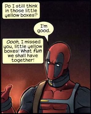
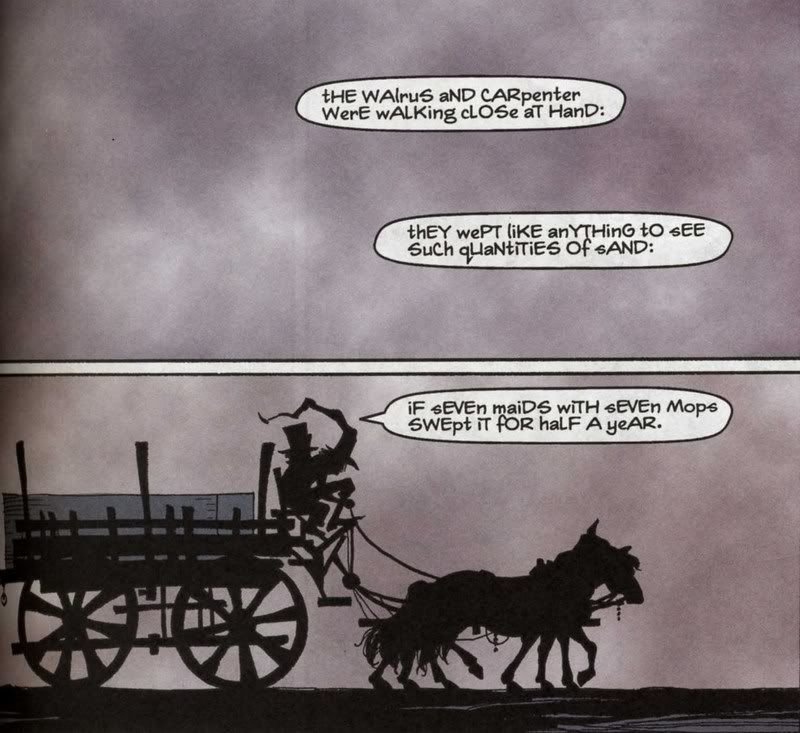
Jeph Loeb's Batman: The Long Halloween is a terrific example of narrative text for voices.
The Mad Hatter speaks with letters capitalized to signify enunciation, much like what some Dadaists were trying to do. This helps make him creepier and less human.
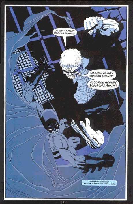
Solomon Grundy is a walking tank, but can only remember the lyrics to the rhyme "Solomon Grundy." His speech is much bolder and savage, to reflect his nature.
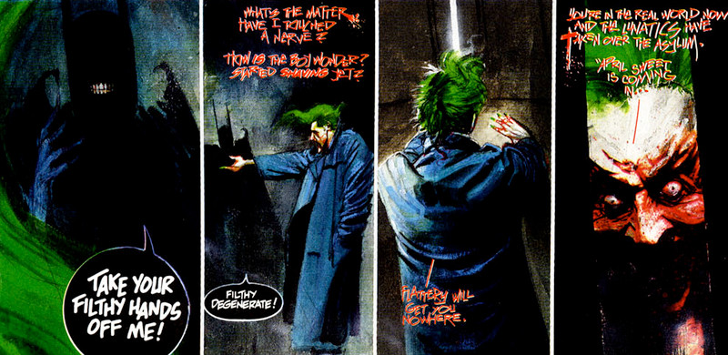
Grant Morrison's Arkham Asylum: A Serious House on Serious Earth takes narrative text to the extreme with the Joker. Speaking entirely in bloody, smeared letters, the Joker's texts reflect the violent psychopath that he is. Also note how Batman speaks in black speech bubbles to help illustrate his dark nature.
- cOLin


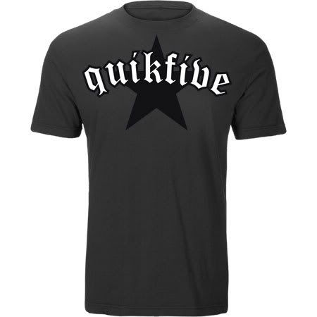 I believe the reason why Old English is such a popular font is a result of brand name companies using it on their merchandise and advertisements, such as the shirt above.
 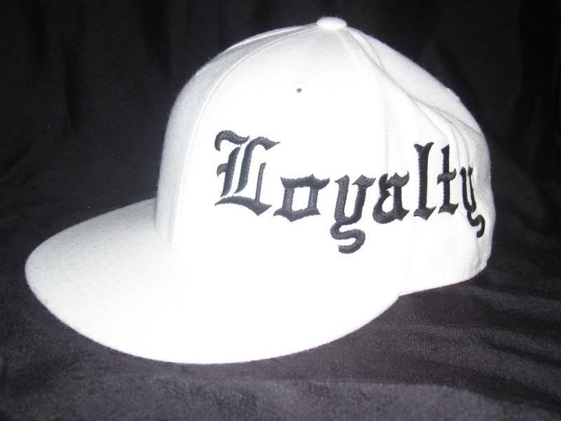 (FYI: Old English is a pain in the butt to embroider on hats)
