1) What font could be substituted
Or, failing that:
2) How hard would to be for me to forge it
There are some things I have noticed over the years I’ve worked there, such as that the younger customers tend to prefer fonts like Cooper, Impact, Ireland, Old English, and (shudder) Curlz. Cooper and Impact I can understand; as they are very popular fonts for shirts due to their easy-to-read designs. However, Ireland and Old English are very difficult to read sometimes, especially on a shirt thirty feet away. I believe those particular fonts are chosen because they “look cool” and not because of their readability.
 I believe the reason why Old English is such a popular font is a result of brand name companies using it on their merchandise and advertisements, such as the shirt above.
![]() The extremely popular video game Grand Theft Auto: San Andreas utilized Old English font to give the logo a more West Coast/Los Angeles feel.
The extremely popular video game Grand Theft Auto: San Andreas utilized Old English font to give the logo a more West Coast/Los Angeles feel.
The point I am trying laboriously to get to is that the typeface Old English is still alive and well today among today’s youth. From hats to shirts to wristbands, it seems like every teenager these days wants the words in Old English.
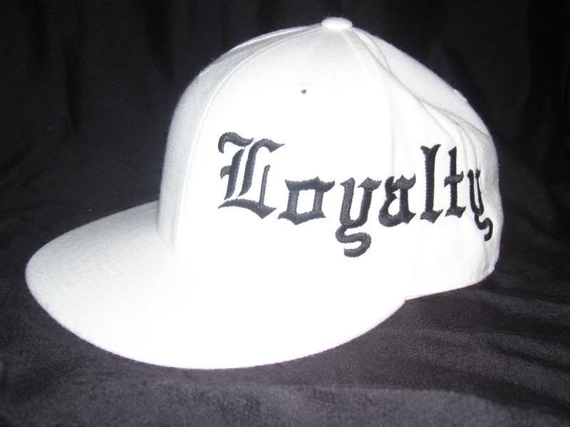 (FYI: Old English is a pain in the butt to embroider on hats)
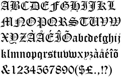
Old English evolved from the font Blackletter, which came about during the Middle Ages when books were still expensive handwritten commodities. Letters became tall and very ornate, which subsequently made them harder to read. Since the vast majority of the population was illiterate anyway, this didn’t affect much.
Blackletter was a very confined typeface, and a lot of the letters tend to look the same, requiring the viewer to read very carefully.
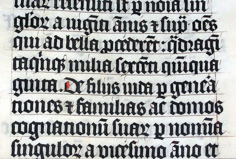
Over the centuries the engraved, elegant style of Blackletter and the Middle Ages evolved into what is commonly referred to as Old English.
- Colin
1 comment:
The shameless commercialization of Olde English... some typographer from the 16th century must be rolling over in his grave over the lost royalties. I think it is interesting how you made the observation of how Old English has been adopted by the West Coast Latino gang sub-culture, long way from Dark Ages Germany. Hitler liked it as well, so that's something him, West Coast Latino Gangs and Affliction T-Shirts have in common. Fonts... bridging the gap between violent sub-cultures.
Post a Comment