Sunday, October 26, 2008

Art Deco and Popular Culture

Art Deco was an art movement characterized by extremely large structures, geometrical shapes and urban environments.

Fritz Lang's Metropolis (1927) used humongous buildings and sharp angles to help convey a feeling of progress and repression in society.


King Kong used towering skyscrapers to help contrast the humongous mountains and jungles of Skull Island.


The video game Bioshock was released in 2007, and utilized Art Deco in many building and sign designs.


The Rocketeer (1991) was a throwback to Art Deco, along with Republic serials of the 1950s like Commando Cody and His Flying Suit. It featured streamlined designs and terrific posters that really captured the feel of the times.


Sky Captain and the World of Tomorrow was inspired by sci-fi films of the 30s and 40s, along with the 1939 World's Fair.


And, just for fun, an Art Deco X-Men poster.

- Colin

Friday, October 17, 2008

Since taking this class, I’ve noticed a lot of old styles and their influences floating around today. This thought first struck me when I came across a flyer with a very Victorian look (i.e.: 10 different, loud fonts) hanging on a bulletin board. *Picture to come* Then there is an Art Deco look to some of the newer buildings downtown, such as the Millennium Hotel.

I also can’t help comparing fashions with those styles, or thinking in those terms.  Like Art-Nouveau-type thinking, and its decorative curvilinear forms, added to jazz up everyday objects into a work of art. Does a belt on a swimsuit really make sense as long as it looks good? (I say no, but to each his own…) 

Of course, I’ll also be very aware of the Arts and Crafts Movement’s legacy as well, for craft fair season is almost here, and hand-made items will always be appreciated.

Dada. It’s like the ultimate paradox.

The movement’s founders were very cynical of the war and society in general. Dissatisfied with humanity, they set out to make anti-art. Dada was intended to lack any meaning whatsoever, which many people consider the point of art.  These anti-artists despised the order of normal art and opted for irrationality instead. It was nonsensical, reflecting what they perceived as the nature of the world around them.

However, this action was in itself a commentary. So oddly, with their art anti-art, Dadaists actually contradicted themselves by creating the very thing they were so determined to avoid: art, with a message.

Thursday, October 16, 2008

Modernism

The modernist movement of the late nineteenth century and early 20th century was a significant point in time for art in general, but was particularly strong in affecting Graphic Design. Although it might not of been noticed as strongly at the time, we can now see its effects clearly in contemporary design. Many graphic art today is based in abstraction. Not all, of course, but many designs are based in simple geometric shapes and forms.

Modernism was a break from the past and a catalyst for the search to find new ways of expression. Past traditions were broken, and there was a new wave coming ashore. Geometric abstraction really took over. Simple shapes and forms which were manipulated to express emotion, thought, and beauty. The movement affected fine art, architecture, interior design, literature, and even music. 

- Jason

Sunday, October 5, 2008

After a visit to the libraries of Webster University, I couldn't help having a new found interest in what I'm now deeming "sculpture books". This type of book is more than just the "pop-up" books of our childhood... it's interactive illustration and sculpted literary arts in the making.

Actually, come to find out, their relation to childhood story books is only a recent occurrence. One of the first known three-dimensional technique for illustrating was actually used for astrology. It was only in the 90's that this style geared back towards an older audience as opposed to children. One such example is The Pop-Up Book of Phobias, a pop-up book that wittingly depicts 10 of the top phobias with engineered genius. (Christmas present, anyone?)

There are many types of three-dimensional books that are covered by this umbrella term of sculpture book: pop-ups, transformations, tunnel books, flaps, volvelles, flaps, pull-tabs, pop-outs, pull-downs, exc. With paper engineering similar to that of origami, sculpture books tend to be more mechanical and pictorial, rather than objects.

World War II Propaganda

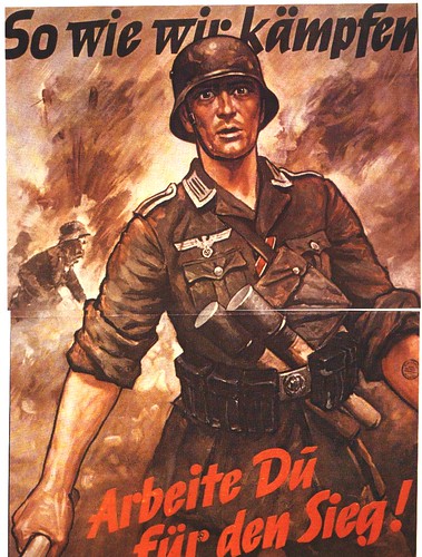
Here's one with an illustration of Hitler leading the charge. I think this poster probably worked well because it displays Hitler as fearless, and leading from the frontline. 
I'm confused about this one. Well, I obviously cannot read German, but the message doesn't seem very clear in the illustration. The solider looks confused.

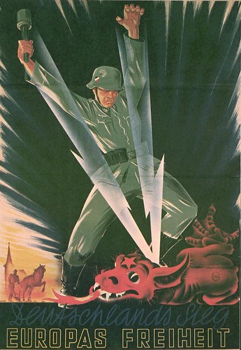
Here's one displaying the enemy as some kind of a hellish looking beast. Hrmmm... I think we've seen this before. There's a poster we looked at in class of a snake with arrows in it from WWI. This one is more clear, but the message is the exact same. 

This one actually reminds me of an artist we studied last semester in World Arts and Ideas II. His name started with an "A". He always signed his work with his initials. This poster has a heroic feel to it, but I don't understand how Germans in the 30s and 40s could relate to this image. Maybe in the Dark Ages...

Typical of Nazi propaganda. A rather bleak illustration with an ominous feel to it. As we were talking about in class, I don't think general public could really identify with this one either. 

- Jason

Washington University Library Visit

The trip to Wash U's library to see, in person, some of the illuminated manuscripts and other early books we have been learning about in class was a great experience. The difference between seeing the photographs of these books on powerpoint slides and being able to literally page through them is huge. You really gain more of an appreciation for how groundbreaking they were at the time they were created. It was interesting to see the different design styles and techniques used. The books were impressive and you could see why some of them were worth as much as a small farm in that time period. It must of been an exhausting process to produce the books. That's one thing I kept thinking to myself while looking through them. 

My favorite display was the contemporary book designs. I'm a "book nerd" so I thought it was interesting to see the many different ways books can be designed. It also got me thinking about how I would go about book design if I ever published one of my own. 

The experience of seeing these various books up close and personal has made me appreciate them more. 

- Jason

Futuristic Futurism

And now, a Futuristic poem of me writing a Futuristic poem:

chk
tck tck tck tck tck pht tck tck tck pht thht
tck tck tck tck pht tck tck tck thht
tck tck tck tck tck tck pht tck tck tck tck thht
tck tck tck tck ptt ptt ptt ptt thht
tck tck tck pht tck tck tck
chk chk

- Colin

WWI Posters

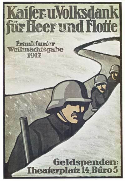
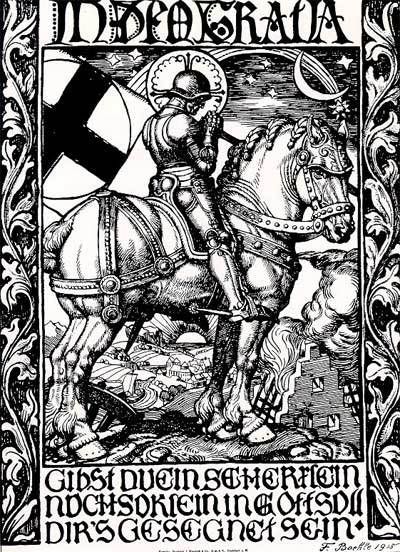
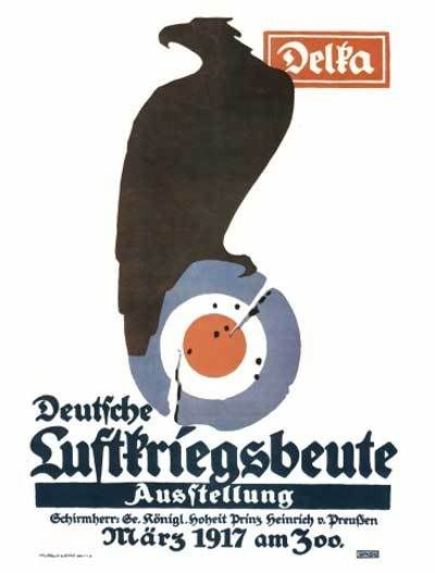
I love war posters. They're so unique and stylized. A visual medium used to get a point across quickly and thoroughly.

And I think that the Germans had much better posters during WWI than the Allies. So there. I suppose that this is because I'm so used to seeing Norman Rockwell and Uncle Sam-styled posters that anything different is just neat-o. From a propaganda point of view, of course, the German posters were a complete and utter failure, while the American and British ones generated tons of support for the war.

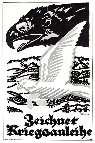
I mean, just look at this one! I don't care if it doesn't harbor any patriotism, that is a great art style.


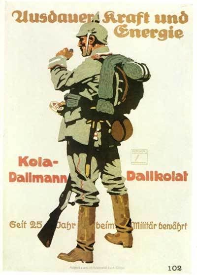
Same goes for this one. I prefer this style over the painted Precious Memories styles of other posters.


And this one is awesome as well. Mimicking the style of Albrecht Durer, it has way more class than most posters.


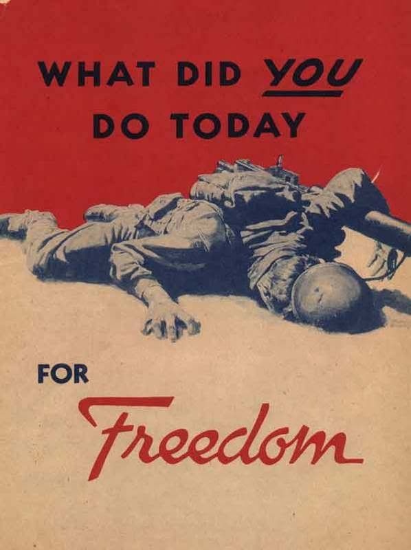
I think the only real flaw of German posters during this time is how dark and depressing they can get. Check this one out. If it wasn't for the German at the bottom it could very well be a poster for Allies. Just swap out the German for "DON'T LET THIS HAPPEN - ENLIST!"


Not that American posters couldn't be just be just as depressing, of course. This one is from WW2, but still. James Lilek's commented, "Again, to restate the point: let's imagine how some people – hell, a lot of people – would react if the government put posters like this in bus stops and public buildings today. People would shriek as if they were having burned skin peeled off with a straight-edge razor. They would be convinced that the transformation of America into a fascist state was finally complete. But this was FDR's America. Just so we're clear."


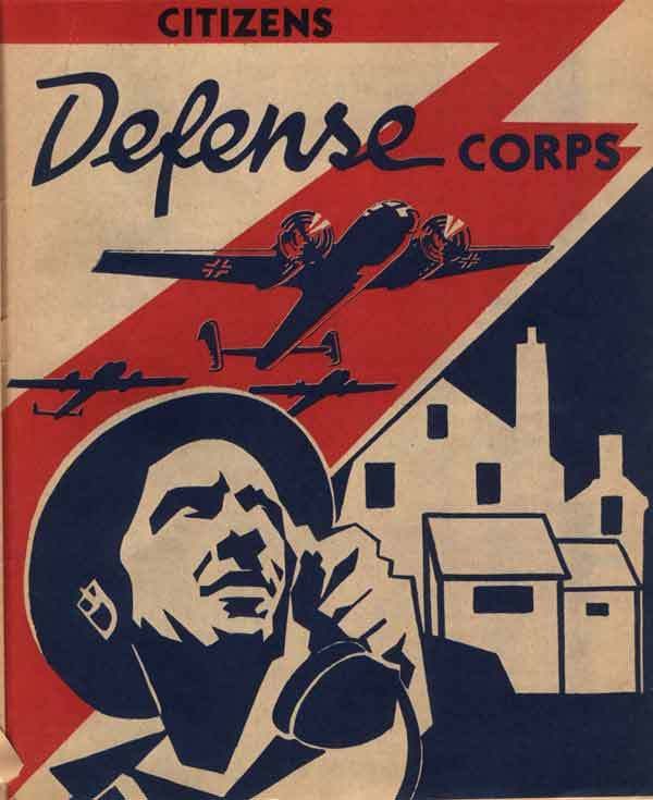
Here's an interesting one: an Allied poster that seems to ape the styles of early German posters.


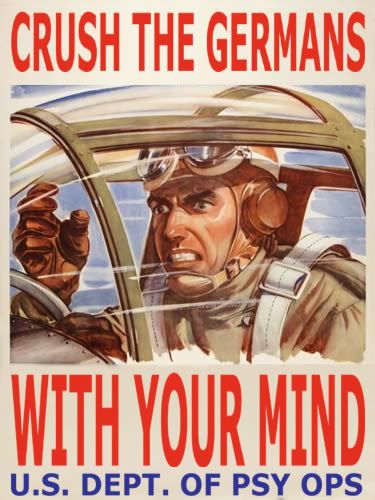
And now, just for fun:
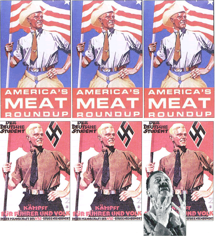
AHH! SECRET NAZI MEAT POSTER!

I love Photoshop, don't you?


- Colin

Sources:
ytmnd.com
macrochan.org
lileks.com
http://www.firstworldwar.com/posters/germany.htm